AWS London Loft Animated Social Banner
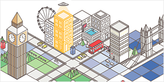
This was an illustration-based campaign that worked on in conjunction with another designer and illustrator while working for Filter Digital. The campaign was for a series of pop-up installations in cities around the world hosted by Amazon Web Services with the aim of engaging developers with their products and services. The campaign was dubbed as the “Pop-Up Loft” series.
A set design and illustration strategy had been created by AWS for the campaign. These included the specifications for the isometric illustration style, specified guidelines for creating new illustration assets, and a suite of pre-made illustrative assets, for our team to work with.
A set of assets, which included an animated social banner, had previously been created by another agency and handed over to AWS, but they were not satisfied with the results. AWS approached the team at Filter and tasked us with updating the overall layout of the illustration, and with creating a new, more dynamic and eye-catching animated banner based on the new creative, while still working within the established AWS Loft illustration style and guidelines.
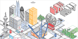
For this project, I worked with another designer/illustrator to create new illustrative assets that represented London in a less generic way, and that incorporated some specific focus on elements of the tech center in east London near the Old Street Roundabout.
I was personally responsible for creating the visuals that represented the Old Street Roundabout, the famous Gherkin Skyscraper from central London, Nelson’s Column, Picadilly Circus, and the beehive-shaped Bezier Apartment Buildings - another landmark near the Old Street Roundabout.
I was also solely responsible for creating the updated animated banner, seen below. The first image in the gallery below was the existing animated banner that we inherited, and the second image is the final result that I created for AWS while working at Filter.
AWS Animated Social Banners
I created these three animated social media banner images for AWS while working at Filter Digital. These were based on existing imagery that had been created in AWS’s illustration style. The particular campaign promoted different aspects of AWS products and offerings that were designed for use with Microsoft Windows Applications.
The goal was to create one layout for each of these three aspects - “Innovate,” “Optimize,” and “Security,” - that used elements pulled from AWS’s existing catalogue of illustrative iconography, and make a short, eye-catching animated graphic for each.
ASK Animated Social Banners
While working freelance, I have done a great deal of work for the Alexa Skills Kit team at Amazon.
The first animated social banner graphic below was for a standalone campaign for the Alexa Skill Kit Japan team’s yearly Skill Award. For 2019, the focus for the campaign was Kid’s Skills, Gaming, and Health.
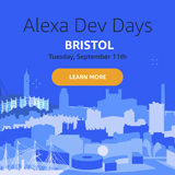
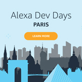
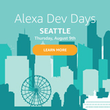
All the other animated banners were created to promote a series of ASK-sponsored events happening at various locations around the world. My task was to create an animated banner for each location which captured essential elements of the location, using the ASK color palate and design/illustration guidelines as a loose visual guide.
In the interest of time, I employed pre-made stock vector graphics in many instances, but in order to ensure that each of the graphics maintained a certain level of originality and dynamic, eye-catching presence, I also created many assets from scratch. I did a bit of research on each of the locations in an effort to create a layout for each city that would be recognizable and iconic to both locals and travellers, while still being fresh and intriguing.
"He Is An Englishman" Kinetic Typography Animation Video
This project was a lot of fun, and was my first project in Adobe AfterEffects. The song is from the Gilbert & Sullivan opera H.M.S. Pinafore.
My approach to this project was to build upon the self-referential, satirical take on the long-outdated Victorian view of the world and England's place in it by including a variety of UK-centric cliches and cultural references that range from the wildly inaccurate perspectives of the average American to a few that may feel more familiar and identifiable to the native Englander.
Using dynamic and fun kinetic typography as the centerpiece, I also created a handful of stylized illustrations as the center of the piece, most notably the stereotypical Englishman with his bowler hat, pinstripe suit and umbrella. To flesh out the backgrounds, and to sell the silly, comical feel of the piece, many of the animated assets were created using existing photography and other media which were stylized to mimick the "cut and paste" animation style used by Terry Gilliam for the Monty Python sketches and films.
